
7 Red Flags Your Coaching Sales Page Is Making People Click Away (and How to Fix Them)
You’ve poured your heart into creating your coaching offer. You know it’s transformative—you’ve seen the results firsthand with your clients. You’ve invested time and money into building a beautiful website that finally feels aligned with your energy. But when you look at your analytics, something doesn’t add up. People are visiting your sales page. They’re spending time there, scrolling through. And then… they leave without booking. Just gone. It’s one of the most frustrating experiences as a coach if your sales page isn’t working. You know your work is valuable. You can feel in your bones that you could help these people. But somehow, that’s not translating through your sales page because you are “guilty” of common salespage mistakes.
Here’s what I want you to understand: your sales page probably isn’t converting—not because your offer isn’t good enough—but because the messaging and layout aren’t supporting someone’s decision-making process.
A sales page has one essential goal: turn an interested reader into an aligned client. It needs to guide someone from curiosity to clarity to commitment. And when that journey isn’t smooth, even your ideal clients click away—often feeling confused, overwhelmed, or like “this probably isn’t for me.”
The good news? These conversion killers are extremely common in the coaching industry, and all of them are fixable once you know what to look for.
Let’s walk through the seven most damaging red flags that might be sabotaging your sales page conversions, and exactly how to fix each one.
Red Flag #1: Your Sales Page Is All About You, Not About Them
I see this constantly with wellness and spiritual coaches, and I completely understand why it happens.
You’re proud of your training. You want people to know you’re qualified. You have a powerful personal story about why you do this work, and sharing it feels authentic and vulnerable. Your coaching philosophy is nuanced and important to you.
So your sales page opens with your certifications, then dives into your personal journey, then explains your unique approach and methodology, and maybe by the third or fourth section, you finally mention what the reader might get out of working with you.
But here’s the problem: people land on a sales page in a particular state of mind. They’re asking very specific questions.
“Is this for me?”
“Will this actually help with what I’m struggling with?”
“Is this the right time for me to invest?”
“Can I trust this person?”
If they can’t answer those questions quickly—within the first 10-15 seconds—they leave. It doesn’t matter how qualified you are or how beautiful your story is. They haven’t gotten far enough to encounter any of that.
How to Fix It:
Lead with them, not with you. The very first thing someone should encounter on your sales page is a reflection of their experience, their desires, or the transformation you facilitate.
Start with language that makes them think “Oh my god, she’s talking directly to me.” Paint a picture of the transformation they’re seeking. Address the core problem they want solved or the feeling state they’re craving.
Then weave in your story—but position it as evidence that you’re the right guide to support them, not as the main event.
For example:
Instead of opening with: “After my own journey through burnout and healing, I became certified in somatic therapy, completed my trauma-informed coaching training, and developed my unique methodology…”
Try opening with: “What if you could move through your day feeling grounded and present instead of anxious and overwhelmed? What if your body felt like a safe place to inhabit instead of something you’re constantly fighting against? This is the transformation we create together through nervous system-focused coaching.”
See the difference? The second version immediately tells the reader what they’ll experience. Your credentials and story come later, once they’re already interested.
Your story is powerful—use it strategically to build trust after you’ve already captured their attention.
Red Flag #2: The Promise Is Vague or Abstract
This is perhaps the most common conversion killer for coaches in the wellness and spiritual space.
Your sales page is full of language like “find your empowerment,” “live your purpose,” “unlock your next level,” “step into alignment,” or “embrace your authentic self.”
These are lovely sentiments. They sound beautiful. And they mean absolutely nothing concrete to someone trying to decide if they should invest $2,000 in your coaching program.
Here’s the truth: a confused mind doesn’t buy.
When someone finishes reading your sales page and still can’t clearly articulate what will be different in their life after working with you, they won’t invest. The transformation feels too abstract, too uncertain, too risky.
How to Fix It:
Make the transformation tangible and specific. Answer these questions clearly:
- What will they feel on a daily basis?
- What will they be able to do that they can’t do now?
- What specific changes happen in their everyday life?
- What is the concrete before-and-after shift?
Instead of: “You’ll unlock your next level and step into your power.”
Try: “You’ll wake up feeling genuinely rested instead of anxious about the day ahead. You’ll set boundaries without guilt consuming you for three days afterward. You’ll trust your intuition enough to make decisions with confidence instead of second-guessing everything and asking everyone else’s opinion first.”
See how much more compelling the second version is? Someone reading that can actually imagine the experience. They can assess whether that’s what they want. They can picture their life with those changes.
Use specific, sensory language. Tell them what their mornings will feel like. Describe how their relationships will shift. Paint a vivid picture of the life that becomes possible.
Yes, transformation is sometimes ineffable and deeply personal. But your job on a sales page is to make it concrete enough that someone can say “Yes, that’s exactly what I want” or “Actually, that’s not quite what I’m looking for right now.”
Both responses are valuable. Clarity serves everyone.
Red Flag #3: There’s No Social Proof or Evidence of Results
Let me be blunt: testimonials are not optional. They’re not “a nice extra if you have them.” They are trust currency, and without them, your sales page is trying to make a deposit with no funds in the account.
If your sales page lacks client success stories, specific examples of transformation, screenshots of messages, measurable outcomes, or any form of case study, people will question your credibility—even if your work is genuinely profound.
I know this feels vulnerable, especially if you’re newer or if your work doesn’t produce easily quantifiable results. But the absence of proof creates doubt, and doubt kills conversions.
How to Fix It:
Show concrete evidence that transformation is possible with you as the guide. Even if you don’t have dozens of testimonials yet, there are ways to demonstrate proof:
Share “before and after” mindset shifts. You don’t need dramatic weight loss photos or income screenshots. Emotional and psychological shifts are powerful proof for wellness coaches.
Example: “When Sarah started coaching, she couldn’t make it through a workday without a panic attack. Within six weeks, she was regulating her nervous system in real time and feeling grounded even in stressful situations.”
Highlight specific emotional wins. Things like increased clarity, restored confidence, better sleep, improved relationships, reduced anxiety, newfound courage—these are all measurable outcomes in the wellness space.
Use storytelling testimonials that include context, struggle, process, and outcome. “She’s amazing, I loved working with her!” is nice but not compelling. A 2-3 paragraph story of someone’s transformation is gold.
Ask for voice note testimonials if written ones feel too formal. Sometimes people express their experience more authentically when speaking.
Include screenshots of texts or messages (with permission) where clients share their wins.
If you’re truly brand new and have no client results yet, you can offer beta pricing to your first few clients in exchange for detailed testimonials and case study participation. But make getting those testimonials a priority—they’re that important.
Let real humans speak for the power of your work.
Red Flag #4: The Page Doesn’t Mirror an Emotional Journey
Most coaching sales pages fall into one of two traps:
Trap A: They go completely logical—just lists of what’s included, logistics about session length and frequency, dry explanations of the process. Zero emotional connection.
Trap B: They go all inspiration and emotion—beautiful language about transformation but no concrete information about what actually happens or what’s included.
Neither approach works on its own because buying coaching is both an emotional and logical decision.
Someone needs to feel emotionally resonant with your approach and see themselves in the transformation. They also need logical clarity about what they’re getting, how it works, and whether it fits their life and budget.
How to Fix It:
Structure your sales page to mirror the internal conversation of a buyer. Guide them through an emotional journey:
1. Meet them where they are — Acknowledge their current struggle or desire with empathy and specificity
2. Reflect their deepest desires — Show them what becomes possible, create hope and longing
3. Show the path forward — Explain your approach and why it works
4. Present your offer as the bridge — Detail what’s included and how it supports the transformation
5. Address hesitation and objections — Answer the doubts that are already swirling in their mind
6. Invite them to take action — Extend a clear, warm invitation to the next step
This structure creates a psychological arc that feels supportive and natural. Someone should finish reading your sales page thinking, “She completely gets me, she knows how to help, and I understand exactly what I’m saying yes to.”
That’s when conversion happens.
Red Flag #5: The Calls-to-Action Are Weak or Hidden
You know that feeling when you’re reading something and you genuinely want to take the next step, but you have to scroll around trying to figure out how? It’s incredibly frustrating.
If someone needs to hunt for your booking button or if they encounter it only once at the very bottom of a long page, your conversion rate plummets. Decision-making momentum is fragile—you need to capture it the moment it appears.
Weak, unclear calls-to-action:
- “Learn more”
- “Submit”
- “Contact me”
- “Click here”
These create ambiguity. What happens when they click? What’s the next step? What are they committing to?
How to Fix It:
Create strong, clear, action-oriented CTAs that signal movement and transformation:
- “Apply now—let’s start your transformation”
- “Book your free clarity call”
- “Claim your spot in the next coaching cohort”
- “Schedule your discovery session”
- “Begin your journey here”
Repeat your CTA throughout the page. After each major section, include a button. Someone might be ready to book after reading your approach, or after seeing testimonials, or after you’ve addressed their objections. Give them multiple opportunities to take action at the moment they feel ready.
Make buttons visually stand out. They should be a contrasting color, adequately sized, and clearly clickable. On mobile especially, buttons need to be large enough to tap easily.
Be specific about what happens next. “After you book, you’ll receive a confirmation email with my intake form and Zoom link. We’ll spend 45 minutes exploring whether this coaching container is the right fit for you, with zero pressure.”
Clarity removes friction. Friction prevents conversion.
A call-to-action isn’t just a button—it’s an invitation into transformation. Make it feel like one.
Red Flag #6: Pricing Feels Hidden, Confusing, or Apologetic
Money is one of the most emotionally charged aspects of any sales page, and coaches often handle it in ways that accidentally undermine trust.
If visitors have to work to find your pricing, scroll through multiple pages, or book a call just to get basic cost information, they start making assumptions:
“It must be way too expensive if she won’t even list it.”
“This probably isn’t for someone like me.”
“There’s something sketchy about hiding the price.”
Even if none of those things are true, the perception of hidden pricing creates distrust and causes people to click away before ever finding out if your offer is actually within their budget.
How to Fix It:
Be transparent about pricing in a way that feels aligned for your business model.
You have a few options:
- List your pricing clearly — “Investment: $3,000 for three months” or “Starting at $1,800”
- Provide a meaningful range — “Investment ranges from $2,000-$5,000 depending on the container and level of support”
- If you truly have variable pricing based on customization — “We’ll discuss your specific package and investment during your discovery call, but to give you context, clients typically invest between $X and $X for this level of transformation”
Whatever you choose, provide context around the pricing. Help people understand what’s included and what transformation this investment supports.
“This three-month container includes twelve private sessions, unlimited Voxer support, personalized practices, and a comprehensive resource library. My clients typically experience significant nervous system regulation, restored confidence, and lasting tools for continued growth. Investment: $4,200 or three monthly payments of $1,500.”
When you frame pricing in relationship to value and transformation rather than just listing a number, it helps people assess whether it’s aligned for them.
And please, don’t apologize for your pricing. Phrases like “I know this might seem like a lot, but…” or “Some people think coaching is expensive, however…” undermine the value of your work before someone has even decided how they feel about it.
Name your price with confidence. The right clients will see the value. The ones for whom it’s not a fit will self-select out, which is actually perfect—you don’t want people who resent the investment.
Money is emotional. Your job is to create safety and clarity around it, not hide from it.
Red Flag #7: It Doesn’t Sound or Feel Like You
People don’t just hire coaches—they hire energetic matches. They’re looking for someone whose presence, approach, and values resonate with their own.
If your sales page sounds generic, corporate, like it was written by AI, or exactly like every other coach in your niche, you’re losing the very thing that would make someone choose you over anyone else—your unique essence.
I see this happen in two ways:
First, coaches use template language that feels safe but soulless. Every sentence could apply to any coach anywhere.
Second, coaches hire copywriters who don’t understand the coaching space and end up with sales pages that sound like they’re selling software or consulting services, not transformational healing work.
The energetic connection required for someone to say yes to coaching can’t happen through generic messaging.
How to Fix It:
Infuse your sales page with your actual personality and voice:
Use stories from your own experience that feel relevant and vulnerable. Share client language—the actual words your clients use to describe their struggles and transformations (this is called voice-of-customer data and it’s gold). Let your values show up clearly in how you position your work and who you say it’s for and not for.
Match your design to your energetic brand essence. If you’re a grounding, earthy somatic practitioner, your sales page should feel calming and embodied. If you work with high-achieving women on bold transformation, your page should feel elegant and confident.
Read your sales page out loud. Does it sound like something you would actually say in conversation? Or does it sound like corporate marketing speak?
Your ideal clients are energetically sensitive people who can tell when something feels authentic versus performative. Let them feel you through your sales page.
Aligned design attracts aligned clients. When your sales page genuinely reflects who you are, the right people feel it and respond.
Bonus Red Flag: It’s Not Optimized for Mobile Viewing
Here’s a statistic that should change how you think about your sales page: the majority of your visitors—probably 60-80% depending on your audience—are viewing your page on their phone.
They’re lying in bed at night scrolling, or sitting in a coffee shop on a break, or curled up on their couch processing whether they’re ready to invest in themselves.
If your sales page looks beautiful on desktop but is a cramped, hard-to-read mess on mobile—with tiny buttons, text that’s too small, images that take forever to load, or a layout that requires constant zooming and scrolling sideways—you’re losing conversions every single day.
How to Fix It:
Design with mobile as your priority, not an afterthought.
Check your sales page on your actual phone. Better yet, ask a friend to pull it up on their phone and watch them try to navigate it. Where do they get frustrated or confused?
Make sure buttons are large enough to tap easily. Ensure text is readable without zooming. Check that images load quickly even on slower connections. Consider simplifying your mobile layout to focus on the most essential elements.
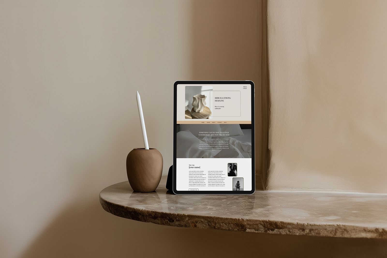
This is one of the reasons I love Showit for coaching websites—you can design a completely custom mobile experience that’s optimized for conversion, separate from your desktop design. You’re not just shrinking down the desktop version and hoping it works.
When someone is making a significant investment decision on their phone at 11 PM, every detail of that experience matters.
What Changes When You Fix These Red Flags
Once you address these conversion killers, you’ll start noticing real shifts in how people interact with your sales page:
More qualified inquiries from people who already understand your work and are genuinely interested. More people saving your page and returning to it multiple times before booking (which is normal and healthy). Less ghosting and hesitation after discovery calls because people are coming in clearer. Clients reaching out already saying “I know I want to work with you, let’s figure out the details.” Sales conversations where people feel ready to commit instead of needing to be convinced. A stronger sense of confidence in your offer because you’re seeing it resonate.
Your sales page transforms from a source of stress into a sacred invitation—a clear, supportive pathway for the right people to say yes to the transformation they’re seeking.
Your coaching work is powerful. You’ve seen it change lives. Your sales page should reflect that depth and value, not undermine it with preventable mistakes.
Ready for a Sales Page That Actually Converts?
If you’re reading this and recognizing multiple red flags on your current sales page, don’t panic. Awareness is the first step, and now you know exactly what to fix.
You have a few options for moving forward:
DIY with strategic templates: If you want to handle this yourself, start with a proven sales page template designed specifically for coaches. This gives you the structure and conversion strategy already built in—you just customize the content.
Get strategic support: Sometimes you don’t need a complete rebuild. You need someone with expertise to audit your current page, identify the specific issues, and give you a clear roadmap for fixes.
Invest in professional design: If you’re ready for a sales page (and complete website) that’s custom-designed for conversion, crafted specifically for your offer, and built to support sustainable growth, that’s where comprehensive website design comes in.
Whatever path you choose, the most important thing is taking action. Every day your sales page isn’t converting is another day of lost opportunities to serve people who genuinely need your support.
Your dream clients are out there searching for exactly what you offer. Make sure your sales page gives them the clarity and confidence to say yes.
Ready to transform your sales page? Explore coaching website design here or browse Showit templates here.


