
Why Mobile-Optimized Website Design for Photographers matters
In today’s digital-first world, most potential clients are browsing your photography portfolio on their smartphones or tablets. If your website isn’t mobile-friendly, you’re not only frustrating visitors—you’re actively losing potential bookings. Slow-loading pages, misaligned galleries, and tiny buttons can turn someone excited about your work into a client you’ll never book. Mobile-optimized website design isn’t just about making your site look pretty on a smaller screen—it’s a strategic investment. It improves the user experience, encourages more inquiries and bookings, and even boosts your SEO rankings, making it easier for new clients to find you online. In this post, we’ll dive into why mobile-optimized website design for photographers matters, how it directly impacts your bookings, the SEO benefits, and practical steps you can take to make your site mobile-ready. By the end, you’ll understand exactly why a mobile-first approach is essential and how to implement it effectively.
Why mobile-optimized website design for photographers matters
Over 60% of website traffic today comes from mobile devices. For photographers, this statistic is huge. Your clients are often busy individuals scrolling Instagram, checking emails, or searching for photographers on the go. If your website isn’t optimized for mobile, you’re missing a huge portion of your audience.
Here’s why mobile optimization is critical:
- Client behavior matters: Mobile users expect fast-loading, easy-to-navigate websites. If they can’t find what they need quickly, they leave—and most don’t come back.
- Google prioritizes mobile-friendly sites: Google has shifted to mobile-first indexing, which means your website’s mobile version is the primary factor in your search rankings. If your site isn’t mobile-friendly, you’re less likely to appear at the top of search results.
- Competitive advantage: Many photographers still have desktop-focused websites. A mobile-optimized site instantly sets you apart as professional and client-friendly.
In short, a website that performs well on mobile devices isn’t optional—it’s essential for growing your photography business.
How Mobile-Optimized Websites Increase Bookings
Mobile optimization doesn’t just help with Google rankings—it directly impacts your bottom line by making it easier for potential clients to interact with your site and book your services. Let’s break it down.
Faster Loading Times
Mobile users are impatient. Research shows that if your website takes more than three seconds to load, 53% of visitors will abandon it. That means your beautiful portfolio and pricing page could go unseen if your site is slow.
For photographers, this is particularly important because high-resolution images often increase load times. Mobile optimization includes compressing images without losing quality, minimizing unnecessary scripts, and ensuring your hosting provider supports fast loading speeds.
User-Friendly Navigation
A mobile-friendly website isn’t just about shrinking your desktop site—it’s about rethinking navigation for smaller screens. Clear menus, thumb-friendly buttons, and intuitive galleries ensure clients can find what they need quickly.
For example, a potential wedding client should be able to:
- Open your site on their phone.
- Scroll through a portfolio gallery.
- View pricing or packages.
- Tap a “Book Now” button.
When all of this happens effortlessly, your chances of converting visitors into booked clients increase dramatically.
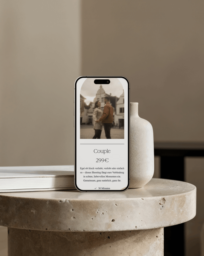
Seamless Contact & Booking Forms
Nothing kills a potential booking faster than a form that’s hard to fill out on mobile. Tiny fields, misaligned buttons, or forms that don’t scale can frustrate users.
Mobile-optimized forms are easy to complete and integrate smoothly with scheduling tools like Acuity or Calendly, allowing clients to book directly from their phones. This reduces friction and boosts your conversion rate.
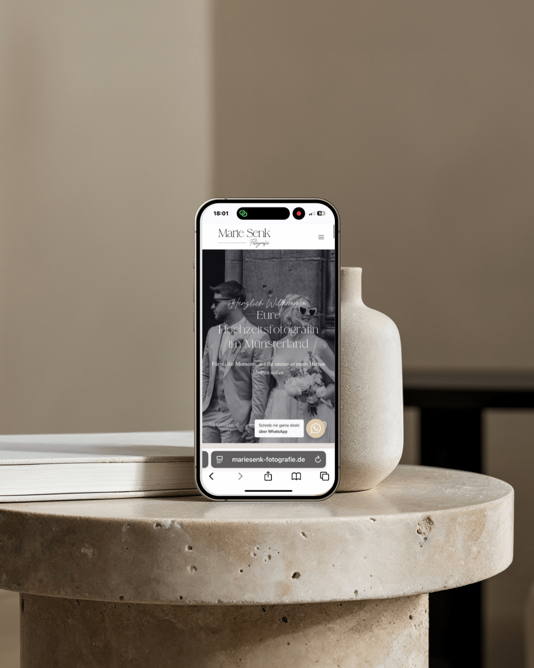
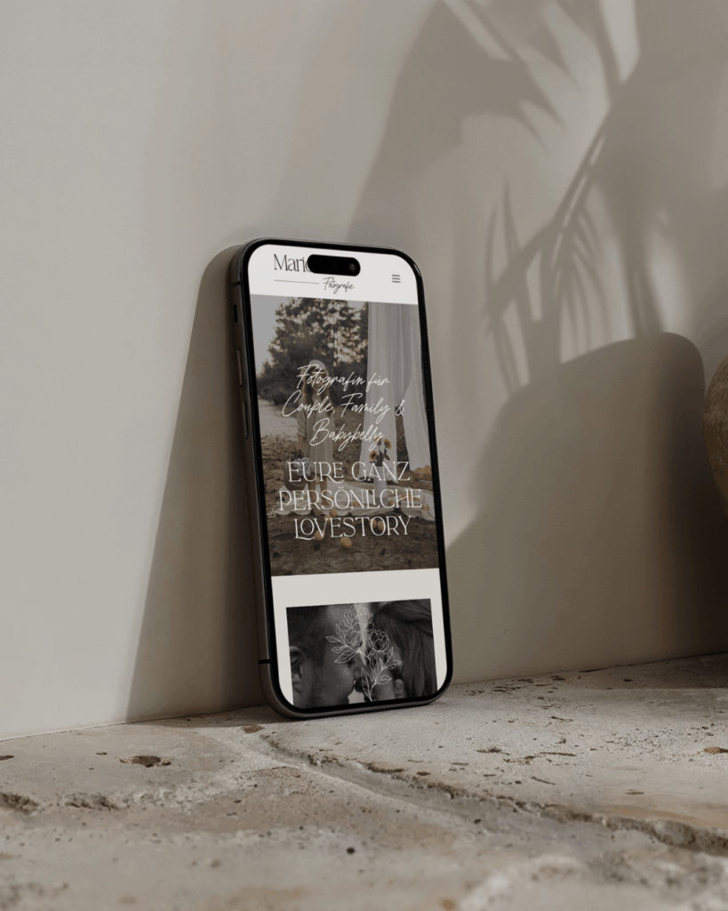
Portfolio Visibility
Your portfolio is your digital storefront. On mobile, images must scale properly without losing quality or becoming distorted. Using responsive grids and mobile-friendly galleries ensures your work shines no matter the device. Clients can swipe through images easily, keeping them engaged longer and increasing the likelihood of inquiries.
SEO Benefits of Mobile-Optimized Website Design for photographers
A mobile-friendly website doesn’t just help clients—it also helps search engines find and rank your site. Mobile optimization and SEO are deeply connected. Here’s how:
Google’s Mobile-First Indexing
Google now evaluates the mobile version of your website first when determining rankings. If your site isn’t mobile-friendly, your desktop version won’t compensate. A responsive, mobile-ready design helps you rank higher in search results and reach clients actively searching for photographers.
Lower Bounce Rates
Visitors who struggle with slow-loading pages or difficult navigation leave quickly. High bounce rates signal to search engines that your website may not provide value, which can hurt your SEO. A smooth mobile experience keeps users engaged and boosts your SEO score.
Improved Core Web Vitals
Core Web Vitals are key metrics Google uses to measure user experience, including:
- Loading performance
- Interactivity
- Visual stability
Mobile optimization addresses these areas, helping your site perform better in search rankings and provide a seamless experience for visitors.
Local SEO Advantage
Most clients searching for photographers are looking for someone nearby. Mobile users often search with “near me” queries. A mobile-optimized website combined with local SEO tactics (Google Business Profile, localized keywords) can significantly increase inquiries from clients in your area.
Key Elements of a Mobile-Optimized Photographer Website
To create a truly mobile-friendly photography website, focus on the following elements:
- Responsive Design: Your website adapts to any screen size, from smartphones to tablets.
- Compressed, Retina-Ready Images: High-quality images that don’t slow down your site.
- Touch-Friendly Buttons & Galleries: Easy navigation for thumb scrolling.
- Readable Fonts & Clear Layouts: Legible text without zooming.
- Integrated Booking & Contact Forms: Simple, mobile-friendly forms that convert.
- Mobile-Friendly Blog/Content: Ensures your SEO and content are accessible on all devices.
By implementing these elements, you provide a seamless experience that converts visitors into clients and boosts your search engine visibility.

Quick Tips to Test Your Mobile Optimization
Before launching or updating your website, check its mobile readiness using these methods:
- Google’s Mobile-Friendly Test Tool: Enter your URL and see a detailed analysis of issues.
- PageSpeed Insights (Mobile Tab): Measures loading speed and core web vitals on mobile.
- Test Across Devices: Check your site on multiple phones and tablets for usability.
- Ask for Feedback: Have friends or clients browse your site and note any frustrations.
Regular testing ensures your site continues to provide a smooth experience as technology evolves.
Conclusion
A mobile-optimized website is no longer a “nice-to-have” for photographers—it’s a necessity. It improves user experience, keeps potential clients engaged, and boosts your SEO rankings, which means more inquiries, bookings, and visibility online.
If your photography website isn’t mobile-friendly yet, now is the perfect time to invest. Whether you’re redesigning your site yourself or hiring a professional web designer, focus on speed, usability, and responsive design. Your future clients—and your SEO rankings—will thank you.
Pro Tip: Pair a mobile-optimized site with SEO-focused content and local SEO strategies to maximize bookings and search visibility.
Ready to make your photography website mobile-friendly and client-ready? I’m a web designer who specializes in photography websites. Get in touch with me today.


